

Problem
Ticketmaster sells tickets to the world's biggest events, and demand arrives in spikes: an on-sale sends enormous, simultaneous traffic at the checkout in a way few consumer products face. Buying a ticket is high-stakes. Miss the window and the show sells out, so a slow or broken checkout is a directly lost sale.
Two things had to be true at once: the checkout had to be fast and dependable under extreme load, and seat selection had to be genuinely usable by fans with disabilities, who were too often handed a "best available" seat instead of the real choice everyone else got, across 17 countries and roughly 180 million users.
Process
The framing decision on the accessibility work was to treat it as a conversion feature, not a checkbox: the goal was equivalence, the same choices by a different route, because a fan who can't independently pick a seat is a fan who can't complete the purchase. That reframing set the bar much higher than an audit-passing minimum. I worked on payments/checkout and the accessible-seating experience.
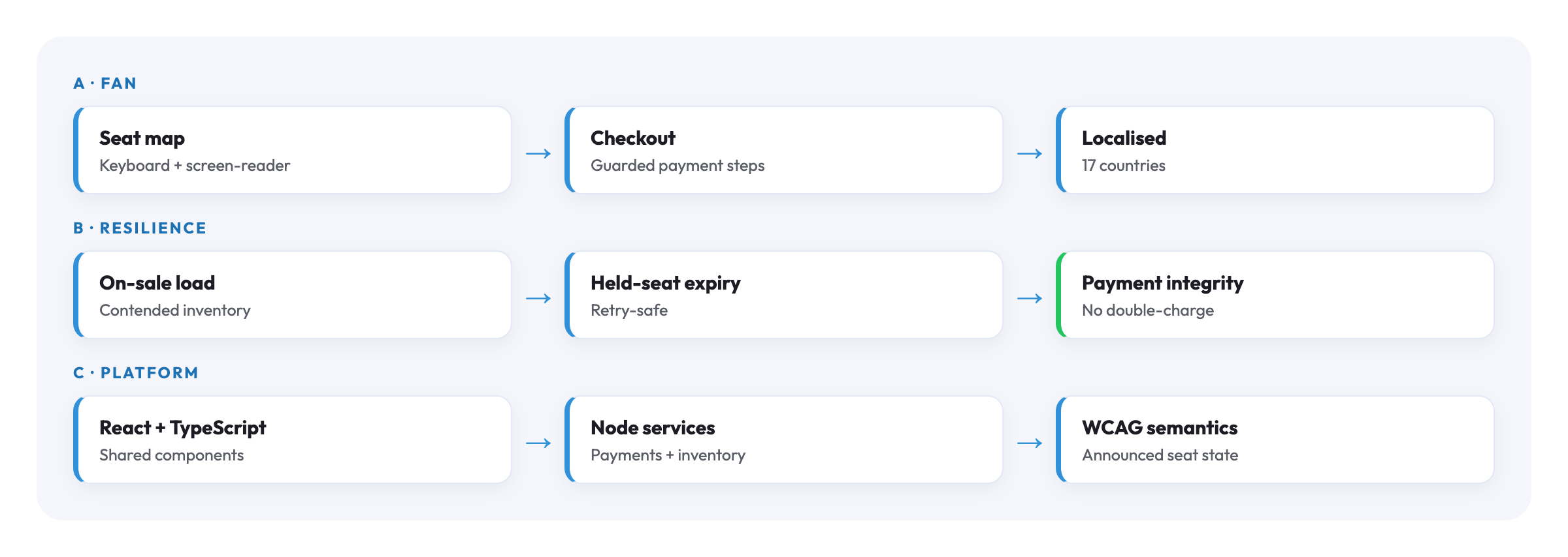
- Resilient checkout. Contributed to the React/TypeScript checkout where correctness under load is everything: clear state, guarded payment steps, and graceful handling of the failure modes that only appear at on-sale scale.
- Accessible seat selection. Built seat selection to accessibility standards: full keyboard navigation of interactive seat maps, screen-reader semantics for availability, price and location, and clear focus management, so a fan using assistive technology could choose a seat, not just be handed one.
- International rollout. Features shipped across 17 countries, so localisation, currency, payment-method differences and regional accessibility expectations were all part of "done."
Outcome
The features reached a platform audience of roughly 180 million users across 17 countries, and the checkout held up under on-sale peaks where a lost second is a lost sale. Accessible seat selection meant fans with disabilities could independently browse and choose seats rather than settle for a lesser path, with accessibility treated as a first-class feature that widened who could actually complete a purchase.
"Treating accessible seating as a real buying experience, not an afterthought, opened the purchase to fans we'd effectively been turning away."
Product Lead
Architecture
For engineersTechnical Deep DiveExpand
Accessibility on an interactive seat map
A seat map is one of the harder accessibility problems in consumer web: a dense, visual, interactive canvas. Making it usable with a keyboard and screen reader meant giving every seat meaningful, announced semantics (section, row, seat, price, availability), a sensible traversal order, and unmistakable focus indication, then testing with real assistive technology, not just an audit tool. The goal was equivalence: the same choices, by a different route.
Checkout under on-sale load
On-sale traffic is unlike steady e-commerce: near-simultaneous demand for a finite, contended inventory. The checkout work centred on predictable state and defensive handling of the edge cases (held seats expiring mid-payment, retries, partial failures) that only surface when thousands of people want the same seats at the same instant.
Trade-offs
- Speed vs safety at the payment step. Checkout must feel fast but must never double-charge or mis-sell inventory. The bias was always toward correctness, with UX tuned around it.
- Consistency vs local nuance. 17 countries want one coherent product but differ in payment methods and currency. Shared components with localised behaviour kept it maintainable.